The Iron Viz feeder competition is a great learning experience and I encourage anyone interested to participate, even if you are new to Tableau. This round served as a reminder for me the importance of adequately timing when vizzing in Tableau, or really working on any project. I often find that ideas will strike a day or two later and the iterative nature of Tableau allows you to keeps building on your dashboard. Unfortunately, I did not leave myself any extra days to reflect on my work, and I ended up revizzing my own Iron Viz entry after the deadline. The reason for my reviz was because I felt that the dashboard needed a better flow to convey the story. I wanted the dashboard to be better able to stand on its own. One of the reasons I love data visualization is that it allows you tell a story with data; however, you must present your story in a way that it is clear to the audience. After revisiting my entry, I decided I could do a better job guiding the audience through my story. While I felt it was clear when I was guiding the story to a family member or friend, I was concerned others would not gain the insights. As a result, I decided to reviz the dashboard adding a more of a directed flow. My reviz was inspired by the entries from Robert Rouse (who ultimately won the feeder contest, congrats!) and Curtis Harris who both used story points to encourage interaction/progression throughout their dashboards. The graphics in my reviz mostly did not change from the original. There were a few new visuals, but the biggest changes were stating the question I sought to answer at the top of each dashboard, and cleaning up the backgrounds—eliminating excess noise. With the questions set I can walk the audience through the story with my visuals.
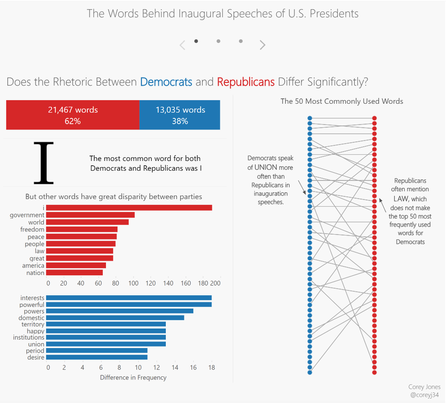
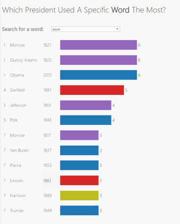
On the first dashboard I uncovered there are certain words that are used with high frequency among both parties, such as “I”, “people” and “government” but other words such as “law” was used noticeable more often by republicans than democrats.
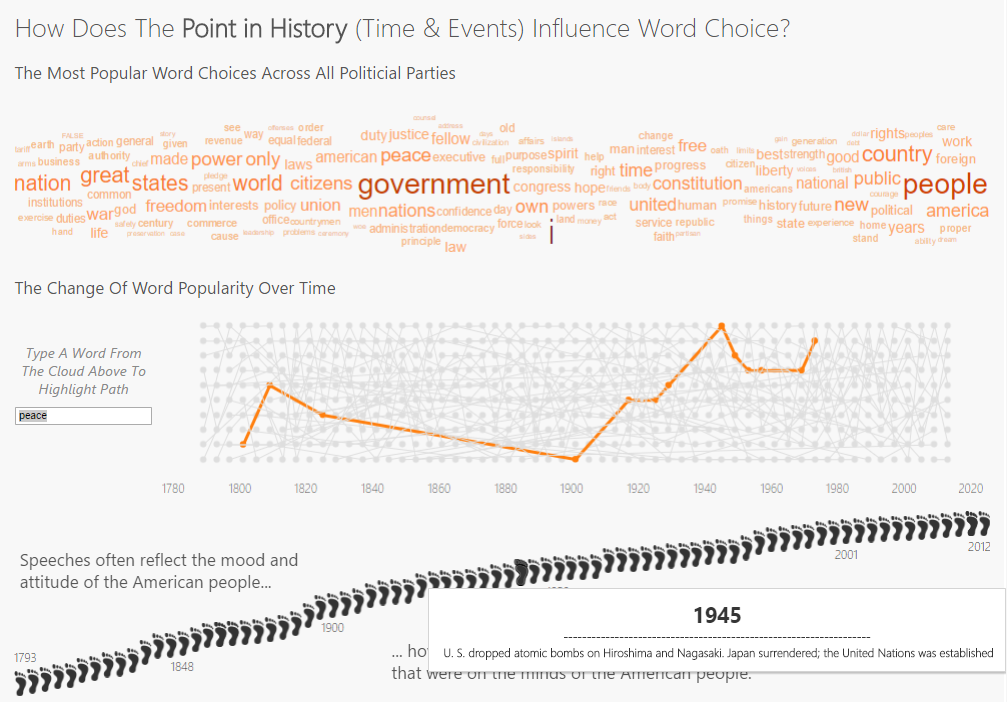
The next area that I wished to explore was if there was a noticeable correlation between the rhetoric in the presidents’ speeches and the world events that were on the minds of the American people. My guess was yes, but wanted to prove it with data. Two interesting insights I uncovered was the peak in the usage of the word “peace” in 1945, and the disappearance of the word “constitution.” Using the graphic in the bottom third of the dashboard one can trace the ramped up usage of the word peace back to key events in 1945: the year which the U.S. dropped the atomic bombs on Hiroshima ending World War II and when the United Nations was formed. It is clear why peace would have been a key talking point for an incoming president.
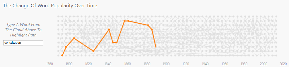
I also thought it was interesting that the word constitution severely dropped off in popularity prior to the 1900s and never returned as a focal point on this stage. Constitution saw its greatest mentions during the 1857 and 1861 speeches around the time of slavery abolitionist movements.
I enjoyed making this dashboard as it was a new challenge for me: quantifying qualitative data. While I am not a political junkie, I certainly learned a bit as a result of this project. I encourage everyone to step outside their comfort zone when vizzing and tackle a new, different topic. It will help you hone your story telling skills as the foreign topic will help make sure your message is clear. Thanks, Corey 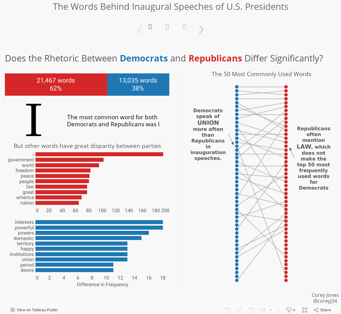
31 Comments
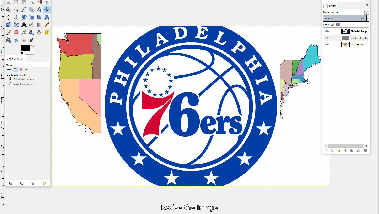
I was at work showing one of my Co-workers my latest Tableau dashboard, and knowing I was a big basketball fan, he suggested-- "why don't you make a NBA free agency viz?" After thinking about the possibility, I thought this was a chance to cross off trying one of the new techniques in the Tableau Public community: arc maps. Specifically, I wanted to make an arc map that showed the movement of players from their former team to their new team. My starting point was to find the location data for the NBA stadiums. The best I could find in terms of a database was a google map with the NBA arenas plotted (Link). Learning #1: How to get data from a google map into excel. It turns out to be relatively easy. From the google map toolbar there is an option to download to KML. Once downloaded as a KML file, simply rename the extension to ".XML", prompting your PC to recognize the file as a XML file. Now open up excel and select connect to a data source, and select XML. Browse and find the data file on your PC. There will be a little formatting required to make it "Tableau ready", but it will get all of the underlying data into Excel! While I was searching for the NBA stadium coordinates I stumbled across some maps with NBA logos plotted on the states (Example 1, Example 2). These maps served as inspiration to create my custom map for Tableau. I first tried simply taking one of the PNG files and setting it as a background map; however the coordinates did not line up properly with the state borders. I decided I would make my own map that would be based off of Tableau's default map which would ensure the coordinately fall in the proper location. Learning #2: How to create a custom map, filling the states with an logo / picture desired, and bringing it into Tableau. In order to create my custom map, I started by making a filled map in Tableau and assigning the state dimension to color, giving states different colors (this will make it easier to select the states in a photo-editing software). I then saved a screenshot to my PC and opened it in GIMP. To create a custom map there are 3 main layers. Layer 1: The old Tableau map, used for selecting states Layer 2: The individual NBA logo (changes based on the state). Layer 3: The final map layer where the cut logos are pasted. The process goes as follow. Position / size the NBA team logo over the state where it belongs. Turn off this layer so that you can see the original map in Layer 1. Go to layer 1 and use the fuzzy select tool (magic wand) to pick up the outline of the state. This will select the border of only the one state because the colors around the state are different and the selection outlines the one color. Then go back to your second layer, the logo, and cut the selection-- this will cut out the portion of the logo in the selection. Go to the third layer and paste the cut logo. This will paste the state (as a logo) in the correct position for Tableau. Repeat these steps until your map is complete. Once you have completed your map. Export the map as a PNG and set it as a background image image in Tableau. Learning #3: How to use arcs in Tableau. I have seen a few great examples of arcs on maps to make the ordinary paths look very elegant. One recent example I saw was Brit Cava's (databrit) map during her first Iron Viz entry of the year examining Top U.S. Aquaculture Imports. She pointed me in the direction of an excellent post by Datablick which has built a template to implement the arcs in your data. Link. Following the guide and leveraging the the provided workbook, it was a painless process! The feedback on the viz has been great, and I hope it keeps coming! Thank you all. My favorite part of the Tableau community is the global feedback that helps you improve and learn new tips & tricks. You also never know what may come of a simple post, so I always recommend sharing your work on Twitter. Soon after posting my dashboard on Twitter, I heard from Seth Partnow of Nylon Calculus about featuring the dashboard on his blog. The dashboard was featured this Friday, 7/15/2016 which you can see / read here: Link. 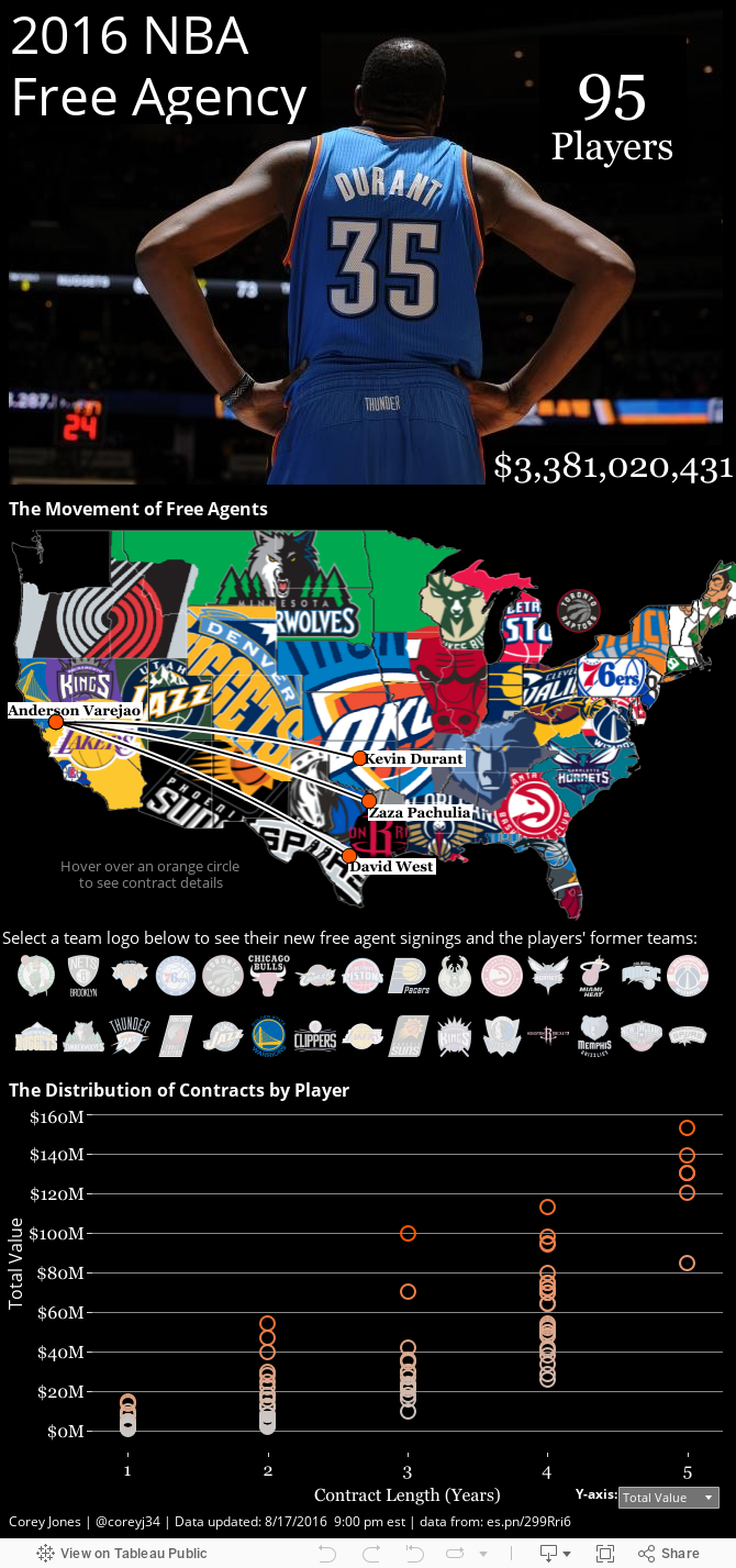
Welcome to my blog! I will be using this as an outlet to provide more details about my Tableau dashboards. I am new to the blogging world. Feel free to leave comments / suggestions on any of my posts. I plan to organize my posts into three categories:
1) Instructional -- Outlining the process on how the dashboard was created. 2) Thought Process -- Examining why the dashboard was created, what questions I hoped to answer and what insights were uncovered. 3) Tips & Tricks -- Useful shortcuts that I uncovered while creating my dashboards, or shortcuts that I read about that were discovered by others and then used in my dashboard (credit will be given). I hope you enjoy, learn and share. Thanks, Corey |
AuthorCorey Jones | @coreyj34 Archives
December 2018
Categories |
 RSS Feed
