|
In 2018 Tableau officially moved to a quarterly released cadence, and as a result, we have seen tons of new features. Below is by no means an exhaustive list, but here are some of our favorites. 1 | Hyper (10.5)Taking you all back to the start of 2018 and the release of 10.5, Tableau unveiled a massive new feature that changed those data files from .tde to .hyper -- the Hyper data engine. Hyper was acquired by Tableau and is its newest in-memory data engine. Hyper has improved extract performance as well as made other front-end features possibles, such as this next new feature... 2 | Viz-in-Tooltips (10.5)Viz in Tooltip was part of an early release in 2018, but still a very essential part of the new features of the year! This allows you to dig even further into your data just by hovering over some marks already in your dashboard and seeing an additional sheet that matches the filters on the mark! 3 | Set Actions (2018.3)A massive new feature for Tableau in the space of design and user experience, Tableau launched set actions in 2018.3. Set actions is a new action type that allows your to control which values are in and out of a set. Set actions can be used to dynamic change a baseline for comparison, drill into details of a hierarchy, and much more. We can't wait to see what you come up with using this feature. 4 | Nested Sorting (2018.2)Let's use Superstore data as an example: have you ever wanted to sort first by Segment and then WITHIN the Segment by Category? Before nested sorted this required several calculations to achieve the correct sorting. Now, Tableau does it automatically! To use this feature, all you need to do is hover over your axis and click the small sort icon once it appears. Simple! 5 | Dashboard Navigation (2018.3)Have you used dashboard actions to navigate from one dashboard to another within a workbook? The dashboard that was at the beginning of Lorna and my friendship was her Friends Iron Viz feeder dashboard which uses this concept to "flip pages." Well, no longer do you need to step up complex actions to move pages and worry about having users clear the selection to use the button a second time; now, Tableau has a new dashboard object called Button which allows your to set up the navigation and it just works! I've personally noticed a slight performance increase as well because I was able to reduce the number of sheets on my dashboard replacing them with objects and reducing the time it takes to render the dashboard. 6 | Transparency: Worksheets (2018.3), Filters & Parameters (2018.2)Transparent parameters and filters were available in 2018.2, meaning you could overlay those clickable options within your visualisation, but NOW, in 2018.3 you can overlay EVERYTHING, with transparent sheets! Have you ever had a scenario where you had filters in a header (which was one color) and more filters in the body of your dashboard (another color)? Before you could only match the dashboard background or the header background -- but now, with transparent filters and parameters they all match seamlessly. So powerful! 7 | Density Marks (2018.3)Look for hotspots in your spatial or scatter plots! A brand new mark type that allows your to visualize data that has many overlapping points easily. Quickly spot the areas with the most data points and the areas with the least.
0 Comments
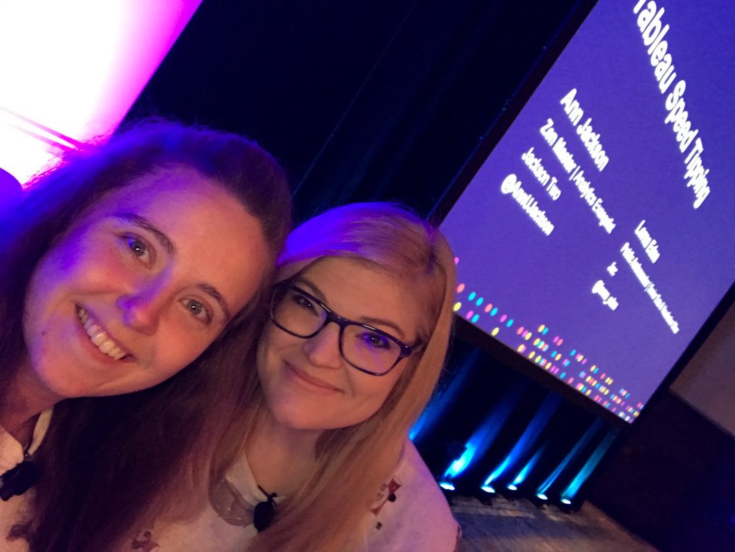
Sooo maybe you are not that into reading and Day 5 blogs were a bit of a drag for you. Not to worry, we have got you covered with podcasts, video tutorials and online presentations for Day 6. 1) #MakeoverMonday BRIGHT Talks // Eva Murray and Andy KriebelMakeoverMonday is my go-to recommendation for people getting started with Tableau. Andy and Eva have gone above-and-beyond to develop a robust community around the project. In addition to providing relatively clean data sets for you to practice with, they host a weekly webinar where you can get feedback on your work, or listen to the feedback they give others. You can participate live during the webinars or watch the recording later. 2) The Fringe FestivalFringe fest was started by Emily Kund and has reached several different locations, EMEA, NORTHAM, LATAM, And APAC. It is a virtual conference that lasts all day. People present online on different Tableau topics and it gets recorded! And most importantly it is FREE! Here is a viz to show all the past fringe fest speakers and presentations 3) Tableau Conference RecordingsTableau Conference is always a highlight, however it is impossible to get to all the sessions you wanted during the week; and that is if you were fortunate enough to attend. So for those who could not attend, or those who had conflicts and could not get to all they sessions they hoped, there's hope! You can watch recordings of just about all of the session on YouTube -- including keynotes. The community is a great group of people, and after watching someone's video if you have additional questions, take to Twitter and see if you can get your answer. 4) Hashtag Analytics // Ann Jackson and Luke StankeIs a YouTube channel but also a podcast, depending on if you want to watch the discussion unfold! It is ran by Ann Jackson and Luke Stanke, one highly opinionated and one highly passionate, still undecided as to who is who. It hosts great structured discussions around hot topics in the Analytics world! It’s a much listen to! 5) #WorkoutWednesday Walk through // Curtis HarrisI love Tableau Public because it allows you to download someone's work and see how they built it. But sometimes you wish you knew what the author was thinking. Well, in this series Curtis is giving you a glimpse into his approach with recorded explanations of how he completed the weekly challenge #WorkoutWednesday. This is a great alternative to reading through a blog if you are a more visual learner. 6) TheWannaBe Podcast // Matt Francis and Emily KundRan by Emily Kund and Matt Francis, this podcast has exciting speakers and podcasts LIVE from the Tableau Conferences! They talk about hot topics and is generally a fun podcast to listen to!
Last year we shared nine blogs that we read, today we are adding another five more blogs to that list. 1) My Data Musings by Sean MillerFrom MakeoverMonday to WorkoutWednesday, SportsVizSunday and ProjectHealth Viz what is Sean not involved in? Sean explains his thought process for building many of his dashboards. Stuck of a WorkoutWednesday? Check out Sean's blog for a tip or two. With a big year in store for 2019, be sure to keep an eye on Sean's blog to hear about his involvement in all of these projects. 2) Ken FlerlageKen’s blog goes above and beyond what you think is possible in Tableau! The way he explains things are super simple and easy to follow along. He also provides data templates to help you build those difficult vizzes! 3) Data Beats by Chris Love and Rob RadburnWhile it is not your typical tips and tricks blog, you will undoubtedly learn a lot about data visualization and life from reading Rob's and Chris' Data Beats. I also highly recommend you check out their #TC18 talk on Youtube. I really appreciate their approach to data viz: starting with a question that interests them, then collecting and often creating and original data set, and finally building visuals to support a narrative to answer to original question. 4) Rosario Viz by Rosario GaunaRosario, Rosario, why are you not Zen, Rosario? I absolutely love Rosario’s blog! She is awesome! She explains things in step by step guides! And would you believe that she can only write English but can only speak a little bit of English! This is incredible! 5) Sir Viz-a-Lot by Matt ChambersMatt consistently publishes high quality content. Recently, Matt has been sharing some awesome tips on Set Actions. Matt has a great focus on data driven design and his clean approach makes the data the star of his dashboards. Learn how he does it on his blog.
Today, Lorna and I will highlight dashboards that we came across in 2018 that taught us something new. One of the great things about Tableau Public is that there is so much inspiration, and even better, most dashboards are downloadable. So, if you see something on Public and you do not know how to make a dashboard "look like that" or "act that way" download the workbook, pick it apart, find that missing piece, and then give the author a shout on Twitter or Linkedin to let him/her know your learned from his/her work. 1 | set actions | lindsey poulterWith Tableau's newest release, 2018.3, came a pretty serious new feature, Set Actions. A new action type which controls the members IN/OUT of a set. If you have been following the amazing work from the Community using set actions, there is no doubt you have come across at least one of Lindsey's examples. Lindsey has been absolutely killing it using set actions. Her creativity and technical ability has produced some amazing results. Lindsey has an entire workbook filled with examples you can learn from -- I learned the power of using the menu action type to give users the ability to control exactly what set is being impacted (image below). Lindsey also wrote the book -- I mean the blog-- that takes a step back and explains how set actions are working! (CJ) 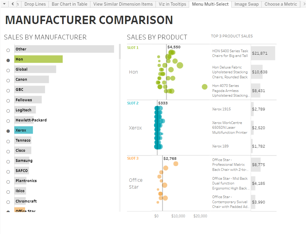 2 | formatting BANs | ann jacksonWorkoutWednesday is a great project teaching people new things week in week out! So Obviously there would be something new from this project. Today I finished a workout from Week 38, courtesy of Zen Master Ann Jackson. When creating BAN's, I normally use the AVG(1) to make the number central. However from now on I will certainly be using this way: Ann used TITLES and the Polygon Marks. This allows you to format the title as you would text! Doesn't make it go really small when adding it to containers! It's a super neat trick which you can see here. (LE) 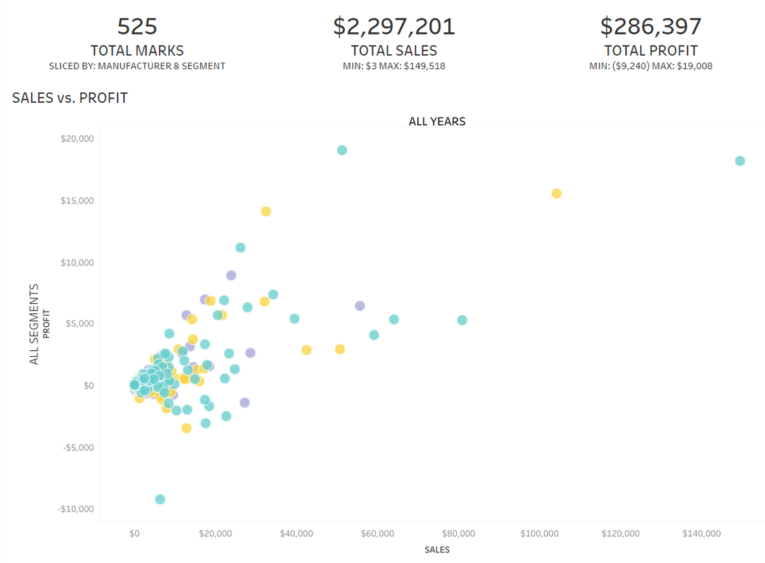 3 | circle outlines | jonni walkerJonni builds absolutely stunning dashboards. One of his signatures, in my opinion, is round elements on his dashboard. I feel like often he would have text or image in a circle, but in 2018 I saw for the first time Jonni use an image over a map to make the Tableau map appear circular. When I saw this, I thought WOW, this is different and it looks amazing. One thing that I share when I talk with people new to Tableau is that I am Community Taught. I learn and enhance my skills through engagement with the Community; from a student to on stage at Iron Viz, my development would not have happened without this community; one of the key elements on my IV dashboard, the globe, was inspired and conceivable to me because of Jonni's work. Thanks for all that you do for this community, Jonni! (CJ)  4 | tree maps | rob radburnI am a big fan of small multiples. I really like how they present, however I wasn't a big fan of Tree maps, UNTIL, Rob Radburn made most of his vizzes with Tree maps. They are excellent at showing lots of information in a small space, and the way Rob does them makes them ascetically pleasing too! Just take a look at his profile for some inspiration. (LE) 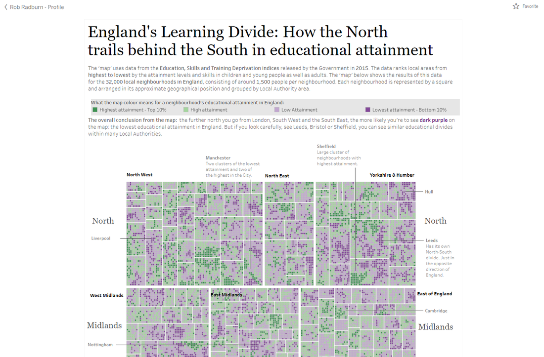 books & literatureThe Amazing Letter E is an absolutely stunning dashboard by Ludovic Tavernier. The originality of this entry is off the charts creative. The design is elegant and the coloring is purposeful & consistent. The interactivity that exists in this long-form dashboard really tops it off for me. Ludo is able to mesh analysis and storytelling with exploration to create one of my favorite dashboards of the year. Seeing this dashboard and knowing Ludo's skills, he certainly brought the best out of all the competitors on stage at this year's Iron Viz. Great work Ludo! 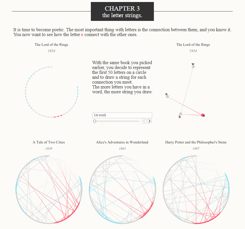 health & well-beingCall me biased as a huge basketball fan, but Curtis Harris' dashboard If I Were Kevin Durant is so much more than a basketball dashboard. The design is impeccably clean -- elements like the shot chart really make this dashboard special; but the simple line charts, dot plots and hover actions make exploring and analyzing this dashboard a joy. I really like how Curtis incorporated all of his legends into text making it easy to understand using colors and unicode shapes. Looking for the last nugget of something special? By clicking on any of Curtis' shots you get to see a Youtube recording of that shot attempt embedded in the dashboard. Great job Curtis! 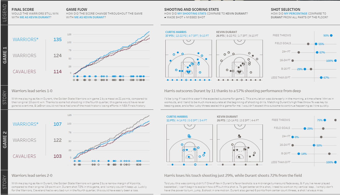 waterMy favourite from this round was by Simon Beaumont's Rainforests Of The Seas. Now I am a big fan of the underwater world, so this immediately caught my eye. I love how Simon has followed a story as if I was going deeper into the ocean! I love the splashes around the maps. Now there are new features out ( SET ACTIONS ) I would potentially revisit this viz and try to add some interactivity, especially in that heatmap! I just love the design of this viz! I think it would look awesome printed and on someone's wall! 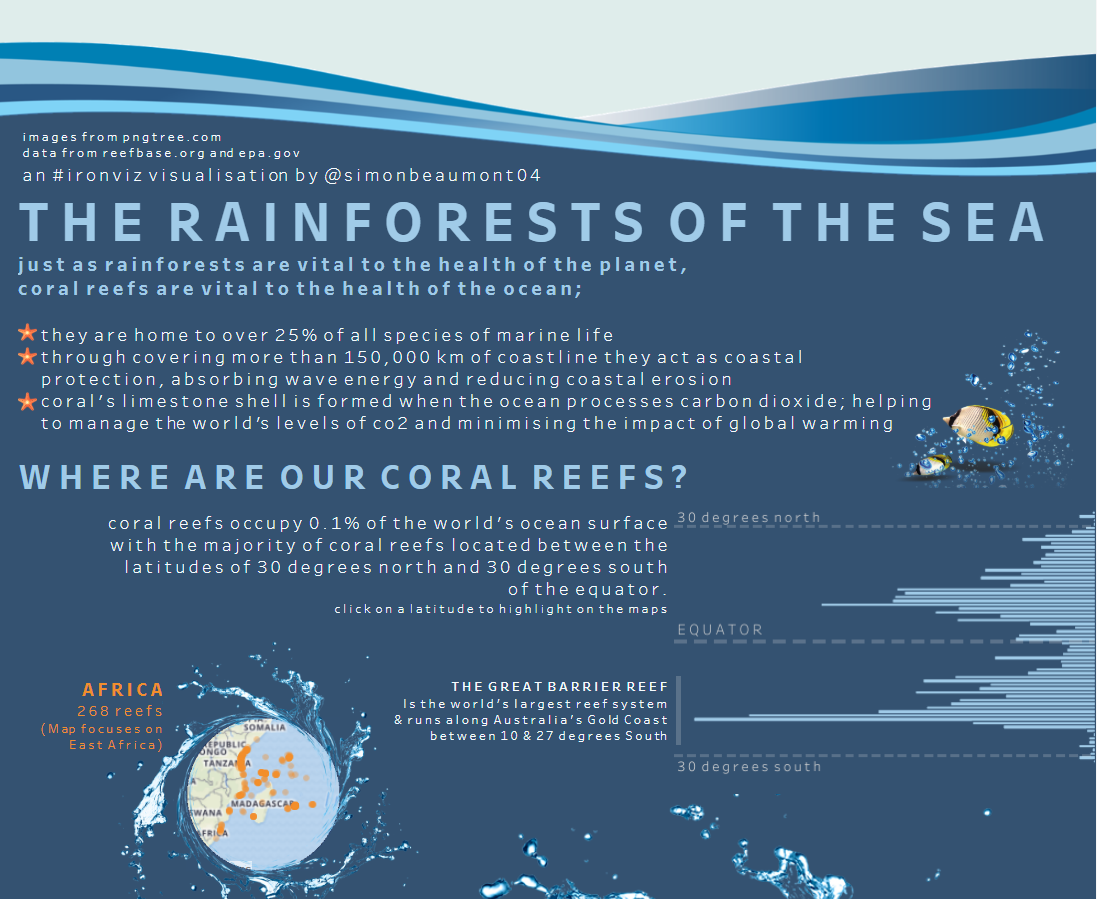 bonus: europeNow I don't think this will come as a shock to anyone but my absolute favourite viz of this round was by Sarah Bartlett. European Cities on a Budget. It is so beautifully elegant and is incredibly designed. I love the story behind how Sarah almost didn't compete in the feeder, but because of a good friend (Obviously Me), helped her grab the data. Knowing how much was in the dataset, I love how Sarah has focused in on the top 5 cheapest, but it does make me want to dig deaper into this dataset. Where is the dearest? So a future viz would be to have an exploratory dashboard to allow those questions to be answered. 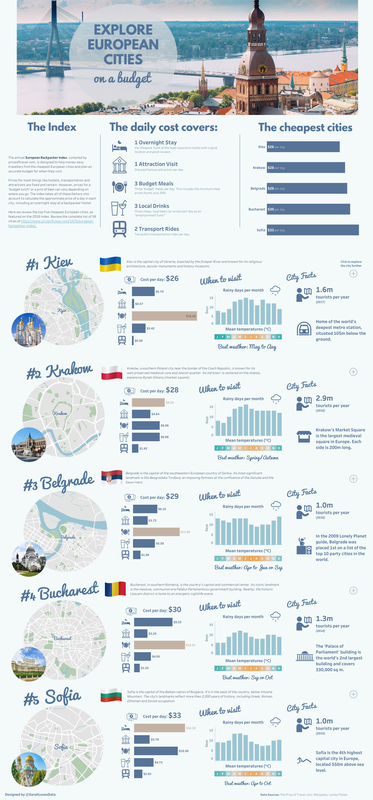 Collective Goal: Be more organized with our #NationalDayProject. We will complete one project a month; Corey is selecting the odd months, and Lorna is selecting the even months! We will announce all of the days at the start of January. Feel free to join us on with our project!
Lorna: This year I am fortunate enough to be co-leading #WorkoutWednesday2019 and co-leading #TableauTipTuesday But apart from the above I want to continue:
And I also want to:
Corey:
2018 has been one hell of a ride! Lorna became a Tableau Public Ambassador, Corey competed on the IronViz stage at New Orleans, they both had speaker slots at the biggest conference so far!
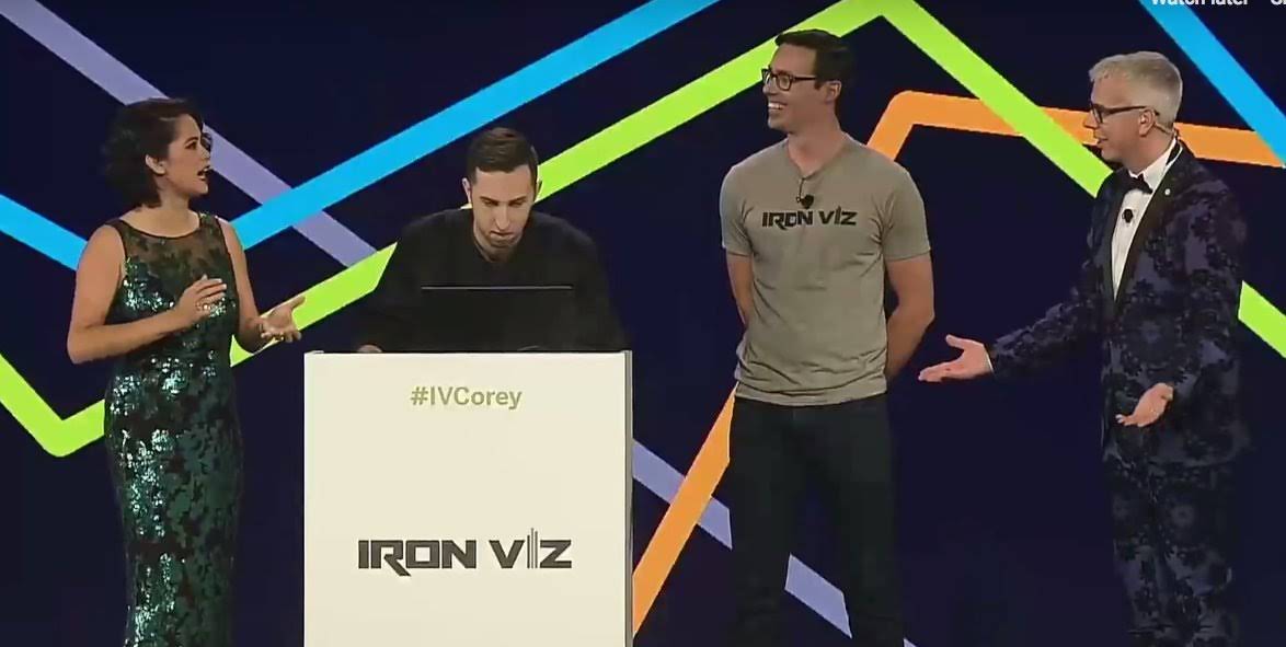
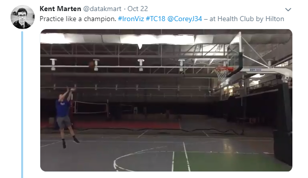
This year was another year filled of TUGs for me (Corey). I am proud of the growth of our #VizItPhilly Tableau User Group. We had great participation and phenomenal content from our community members-- current students, seasoned tableau vets, visiting Zen Masters and brand new community members checking out #MakeoverMonday for the first time -- I love hearing everyone's Tableau story. I also had the opportunity to crash a few other nearby TUGs this year: The Central New Jersey TUG has had a great first year and the NYC TUG is now only a train ride away. I feel very fortunate to be located centrally to all of these groups. As Lorna mentioned at the top, this was certainly a special #TC for me participating in #IronViz. An experience like no other. I urge you to participate in this year's feeders and experience it for yourself. I also made a great new friend as a result, Kent Marten. Kent was my sous vizzer -- he kept me calm, helped me practice and distracted me with some hoops. Thank you! Now I am dealing with the aftermath, Kent a Toronto Raptors fan vs. my Philadelphia 76ers, but you take the good with the bad -- right?
Keep your eyes on the blog to see more highlights of 2018 and a sneak peak of 2019. This year has certainly been one of the best years so far! Looking forward to what is coming in 2019!!
Happy Holidays Lorna & Corey |
AuthorWrite something about yourself. No need to be fancy, just an overview. ArchivesCategories |
 RSS Feed
