|
Daashboard #2 in my favorites collection is an excellent example of storytelling by Matt Chambers. Matt employs a long and tall dashboard technique to raise awareness around an important issue: gun suicides. This dashboard has a clear narrative and sparks a conversation. To me, an important indicator of a successful dashboard is that it evokes a response. In the business world, this could mean it leads a person to asking questions about trends he/she discovered in their business by interacting with the data. In the public sphere, this response is often starting a conversation. Matt effectively utilizes hex maps -- a technique he helped popularize in Tableau-- as well as highlight actions to help navigate the reader through his story. Reflecting back on my own work, I see a lot of influence and inspiration from this dashboard in my US Healthcare Viz. I would love to hear your thoughts on which dashboards sparked a conversation for you, or challenged the way you thought about a topic. Tweet me @CoreyJ34. Thanks for reading. Corey 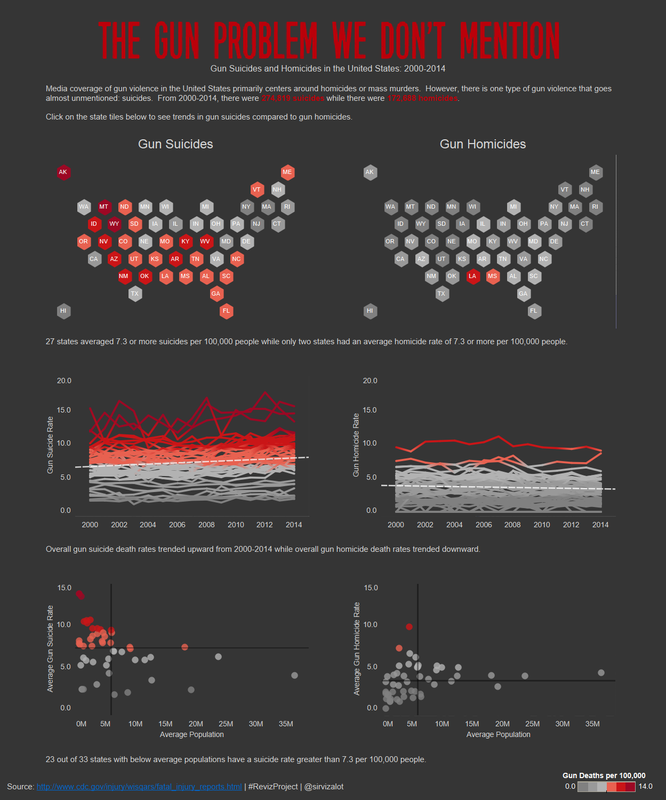
0 Comments
Leave a Reply. |
