|
It is that time of year again: Iron Viz Feeder Contest. Many people are hard at work on their feeder dashboard for the second spot in Iron Viz at TC17. My next favorited Tableau dashboard is by Curtis Harris and it qualified him for the Iron Viz at TC16. One of the important lessons I learned from this dashboard is to viz something that you are passionate about. Curtis's interest and passion shines through this entire dashboard. He is able to take a topic that he is knowledgeable about, baseball, and tell a story that is easy to follow for someone without limited knowledge of the topic. One way Curtis succeeds in telling a clear, coherent story is through his superb use of color. While the overall dashboard has a minimalist feel, the important points are highlighted in color. It is also critical that he does not over-color the dashboard. Color is strategically utilized to emphasis key players and points throughout the story. This dashboard also renders very nicely on mobile. By keeping to graphics simple, the story is clear and accessible both on a PC and on a phone. Thanks for reading and good luck to those participating in this Iron Viz feeder! Corey 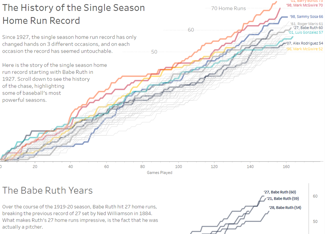
0 Comments
The next dashboard in my Tableau Favorite series is a dashboard circa 2016 MakeoverMonday by Tom O'Hara. The original visual was a *lovely* donut chart. It required significant effort by the reader to go between the legend and the visual to identify what the chart was showing. The colors simply colored the dimensions and did not aid in the telling of a story. The original: 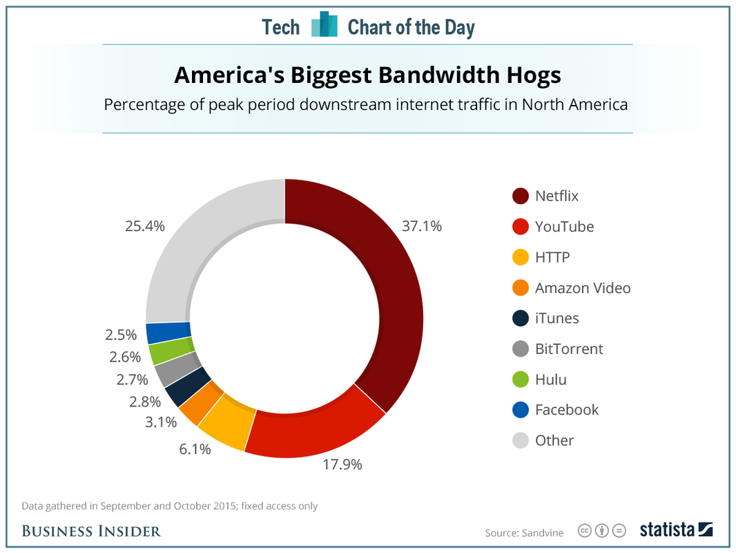 Tom creates a simple visual that has a clear story-- Netflix and Youtbe make up more than half of the U.S. broadband usage during prime time. He uses colors and images (logos) to leverage preattentive attributes and make it easy for the reader to decode his message. I think this an excellent example of why keeping it simple --a simple bar chart-- can be an extremely effective method to connect with your audience. MakeoverMonday is a great way to practice your data viz skills. I would love to hear what tips or techniques you have learned from participating in #MakeoverMonday. Tweet me @CoreyJ34 Thanks for reading. Corey 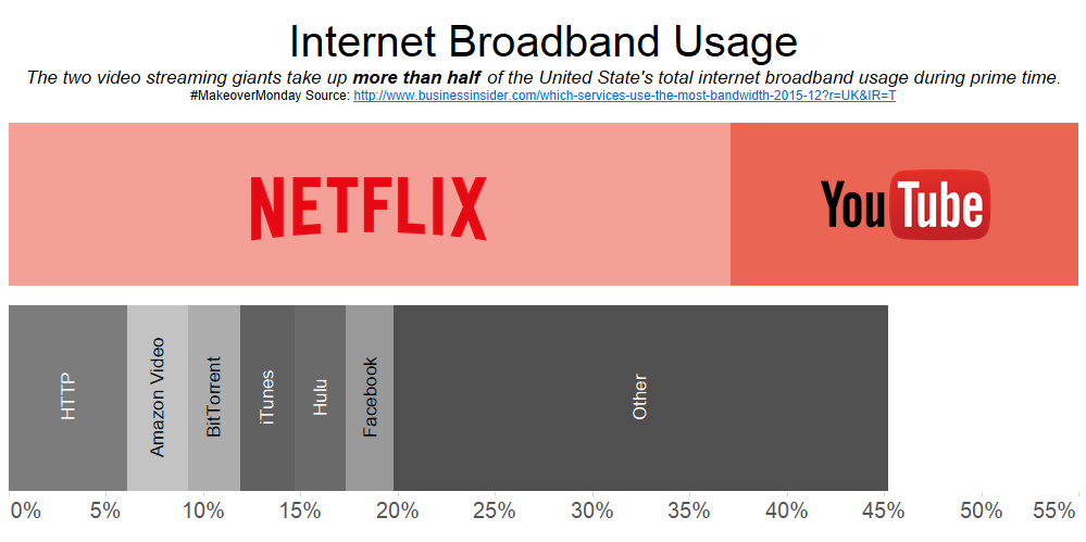 Daashboard #2 in my favorites collection is an excellent example of storytelling by Matt Chambers. Matt employs a long and tall dashboard technique to raise awareness around an important issue: gun suicides. This dashboard has a clear narrative and sparks a conversation. To me, an important indicator of a successful dashboard is that it evokes a response. In the business world, this could mean it leads a person to asking questions about trends he/she discovered in their business by interacting with the data. In the public sphere, this response is often starting a conversation. Matt effectively utilizes hex maps -- a technique he helped popularize in Tableau-- as well as highlight actions to help navigate the reader through his story. Reflecting back on my own work, I see a lot of influence and inspiration from this dashboard in my US Healthcare Viz. I would love to hear your thoughts on which dashboards sparked a conversation for you, or challenged the way you thought about a topic. Tweet me @CoreyJ34. Thanks for reading. Corey 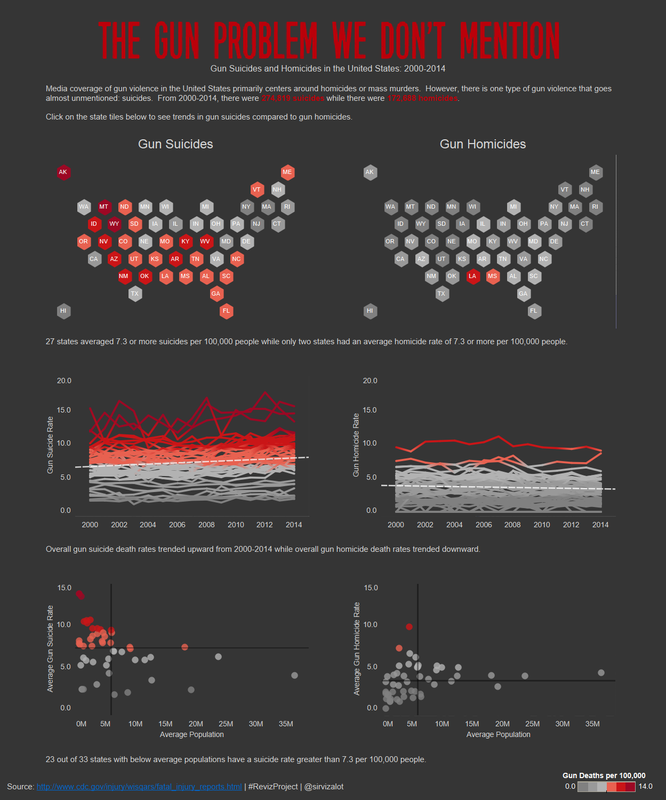 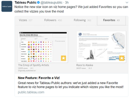 Tableau Public recently announced a new feature: the ability to favorite dashboard and build a collection on your profile. As a result, I decided I would start a new blog series (Data Hawk needed some revitalization anyway) featuring a new dashboard (or two) that I add to my favorites collection each night. My first favorite goes out to Shine Pulikathara for his NFL 2015 Regular Season small multiples dashboard. I saw Shine perform at a mock Iron-viz at a J&J Tableau Day while as a co-op finishing my senior year of college. This was at the beginning of my data viz career, and I had never seen data turned into actionable analytics with such speed before-- and in an incredibly engaging manner. After seeing the power of Tableau throughout the day, I was determined to learn more. It was an obvious choice for me to follow Shine on Tableau Public. Shine's work is remarkably clean and always highlights interesting data-driven insights. His NFL regular season recap was the first time I was exposed to small multiple design. Now of one my favorite design techniques, Shine's work often influences my design choices and thus is #MyFirstFavoriteViz. Share your #MyFirstFavoriteViz on Twitter! Thanks for reading. Corey 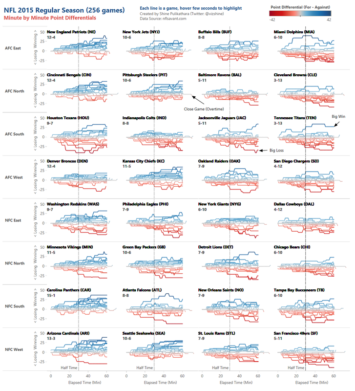 |
