|
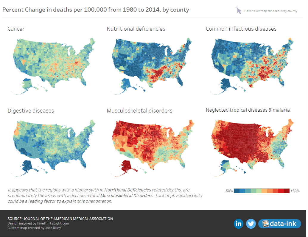
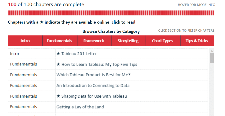
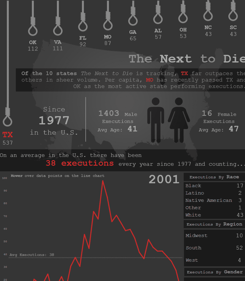
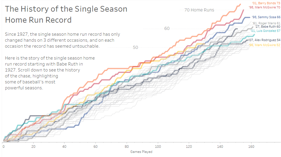
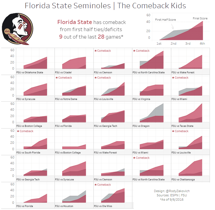
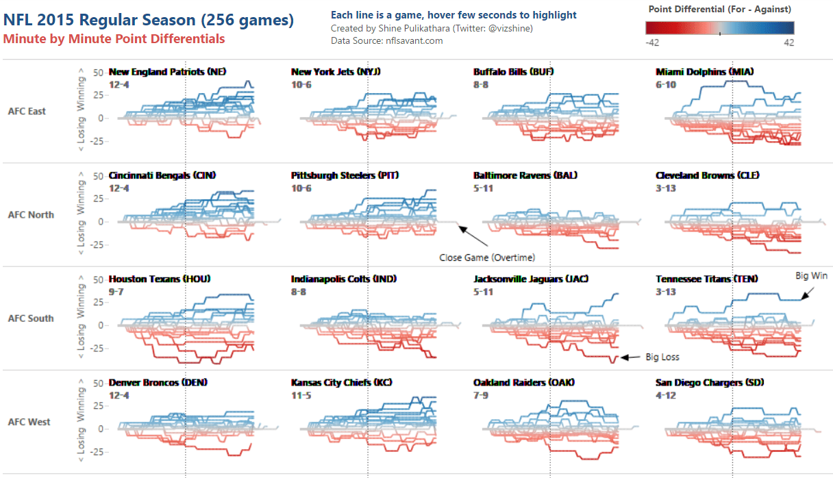
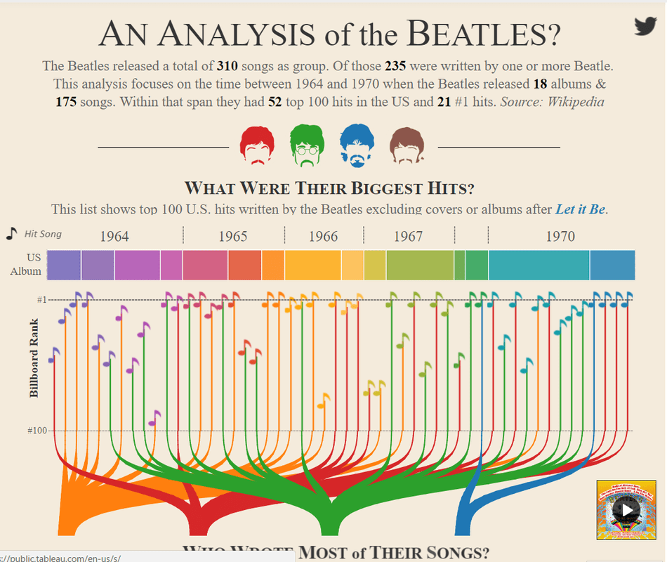
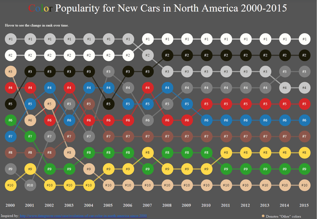
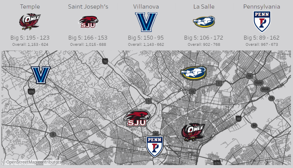
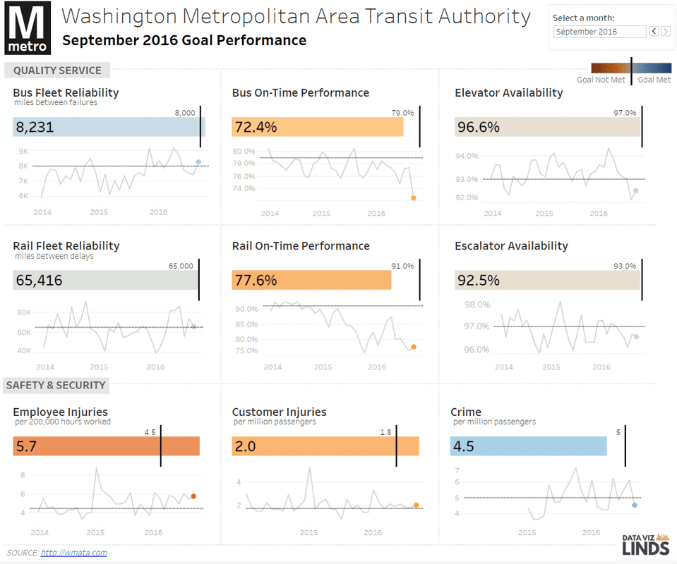
As 2016 winds down, Tableau Public authors have been sharing their favorite dashboards using #VizInReview on Twitter. Here are some of my favorites that have certaintly influenced my work and taught me new skills (in no particular order): Adam Crahen -- Night Biking: You may not even realize it is a Tableau dashboard, built off of actions, Adam integrates Youtube and JS to create a very cool animated dashboard! Josh Tapley & Jake Riley -- Disease Death Rates: Wow, these maps are stunning. Great design and storytelling packed into a very clean dashboard. Ryan Sleeper -- Tableau 201: Have you seen this? A book in a dashboard! The tips and tricks in here are awesome for anyone looking to learn Tableau or hone their skills. Check it out! Pooja Ghandi -- The Next to Die: The design on this dashboard is fantastic. My favorite part is the bar graph perfectly integrated with custom icons to create a striking way to show volume of state executions. Curtis Harris -- This History of the Single Season Home Run Record: The narrative of this dashboard combined with the clean, consistent visuals makes this one of my favorite examples of storytelling this year! This viz was a home run (couldn't resist... sorry). Rody Zakovich -- Florida State Seminoles | The Comeback Kids: I am a sucker for small multiples, but what really tops this one for me are the tooltips. I am sure Adam will approve! Shine Pulikathara -- NFL 2015 Regular Season: Speaking of small multiples, this example by Shine was the first example of small multiples I personally saw in Tableau. I was hooked by Shine's design and almost a year later, I am now hooked on DataViz and Tableau. This one helped kick start it all -- thanks, Shine! Adam McCann -- Beatles Analysis: Published January 2016, it was pretty clear this was going to be at the top of the charts for this year. Almost 770K views later, it is safe to say this data viz has made an impact. Matt Chambers -- Car Color Evolution: My favorite example of a bump chart. This dashboard is clean, engaging and tells a story. It also has attracted many other authors to ReViz it and continue learning new techniques as a result. Lindsey Poulter -- March Madness: You may say I am biased because March Madness is my favorite sporting event, by far, but this viz is elegantly designed with tons of information packed into an engaging, interactive dashboard. Tom O'Hara -- Philadelphia Big 5: Philly basketball. Tom has used some really nice techniques to make his map pop, and incorporated learnings from the community, like Matt's bump chart, into this really cool Big 5 dashboard. Go Hawks! Lindsey Poulter -- MetroVitalSigns: A must for future VOTD, this example of a scorecard is my favorite #MakeoverMonday of the year. I can only imagine how many business applications this design may influence in the future.
0 Comments
Leave a Reply. |
AuthorCorey Jones | @coreyj34 Archives
December 2018
Categories |


 RSS Feed
