|
In a recent dashboard I used custom shapes to create a 10-star rating scale. I first saw this technique used when looking at a Tableau dashboard of Annual Births in a post by Bora Beran 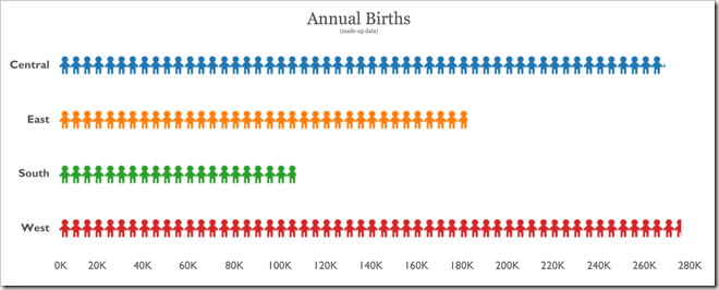 The basic premise is to make custom icons that represent your scale. I made 10 separate custom icons that would represent a filled star from 0.1 to 1.0. This allows you to represent any rating between 0 and 10 (4.1 stars, 6.3 stars, etc).  To make the stars I used PowerPoint. I started with one star that was 1in x 1in. I made the fill transparent and gave it an outline color. I duplicated the star and added a fill color. I overlaid the stars and saved this as “1”. I then began cropping the filled star by .1in and saving each increment as a new image (0.9, 0.8, 0.7, etc). The result is 10 images, each 1/10th more filled than the previous. 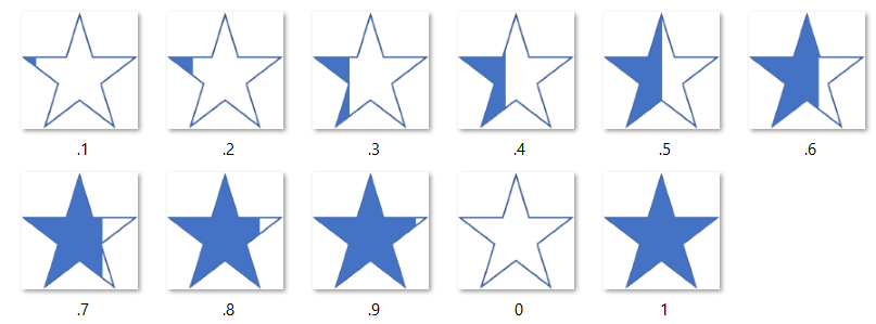 You can now use these custom images in Tableau to represent your rating. By keeping the image transparent, you can change the color using the color mark in Tableau. Let me know if you have any questions! You can download the 10 stars I saved here: LINK. Thanks for reading, Corey 
1 Comment
|
AuthorCorey Jones | @coreyj34 Archives
December 2018
Categories |
 RSS Feed
