|
Today, Lorna and I will highlight dashboards that we came across in 2018 that taught us something new. One of the great things about Tableau Public is that there is so much inspiration, and even better, most dashboards are downloadable. So, if you see something on Public and you do not know how to make a dashboard "look like that" or "act that way" download the workbook, pick it apart, find that missing piece, and then give the author a shout on Twitter or Linkedin to let him/her know your learned from his/her work. 1 | set actions | lindsey poulterWith Tableau's newest release, 2018.3, came a pretty serious new feature, Set Actions. A new action type which controls the members IN/OUT of a set. If you have been following the amazing work from the Community using set actions, there is no doubt you have come across at least one of Lindsey's examples. Lindsey has been absolutely killing it using set actions. Her creativity and technical ability has produced some amazing results. Lindsey has an entire workbook filled with examples you can learn from -- I learned the power of using the menu action type to give users the ability to control exactly what set is being impacted (image below). Lindsey also wrote the book -- I mean the blog-- that takes a step back and explains how set actions are working! (CJ) 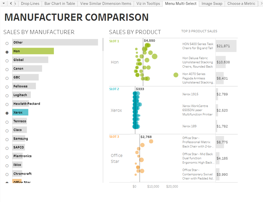 2 | formatting BANs | ann jacksonWorkoutWednesday is a great project teaching people new things week in week out! So Obviously there would be something new from this project. Today I finished a workout from Week 38, courtesy of Zen Master Ann Jackson. When creating BAN's, I normally use the AVG(1) to make the number central. However from now on I will certainly be using this way: Ann used TITLES and the Polygon Marks. This allows you to format the title as you would text! Doesn't make it go really small when adding it to containers! It's a super neat trick which you can see here. (LE)  3 | circle outlines | jonni walkerJonni builds absolutely stunning dashboards. One of his signatures, in my opinion, is round elements on his dashboard. I feel like often he would have text or image in a circle, but in 2018 I saw for the first time Jonni use an image over a map to make the Tableau map appear circular. When I saw this, I thought WOW, this is different and it looks amazing. One thing that I share when I talk with people new to Tableau is that I am Community Taught. I learn and enhance my skills through engagement with the Community; from a student to on stage at Iron Viz, my development would not have happened without this community; one of the key elements on my IV dashboard, the globe, was inspired and conceivable to me because of Jonni's work. Thanks for all that you do for this community, Jonni! (CJ)  4 | tree maps | rob radburnI am a big fan of small multiples. I really like how they present, however I wasn't a big fan of Tree maps, UNTIL, Rob Radburn made most of his vizzes with Tree maps. They are excellent at showing lots of information in a small space, and the way Rob does them makes them ascetically pleasing too! Just take a look at his profile for some inspiration. (LE) 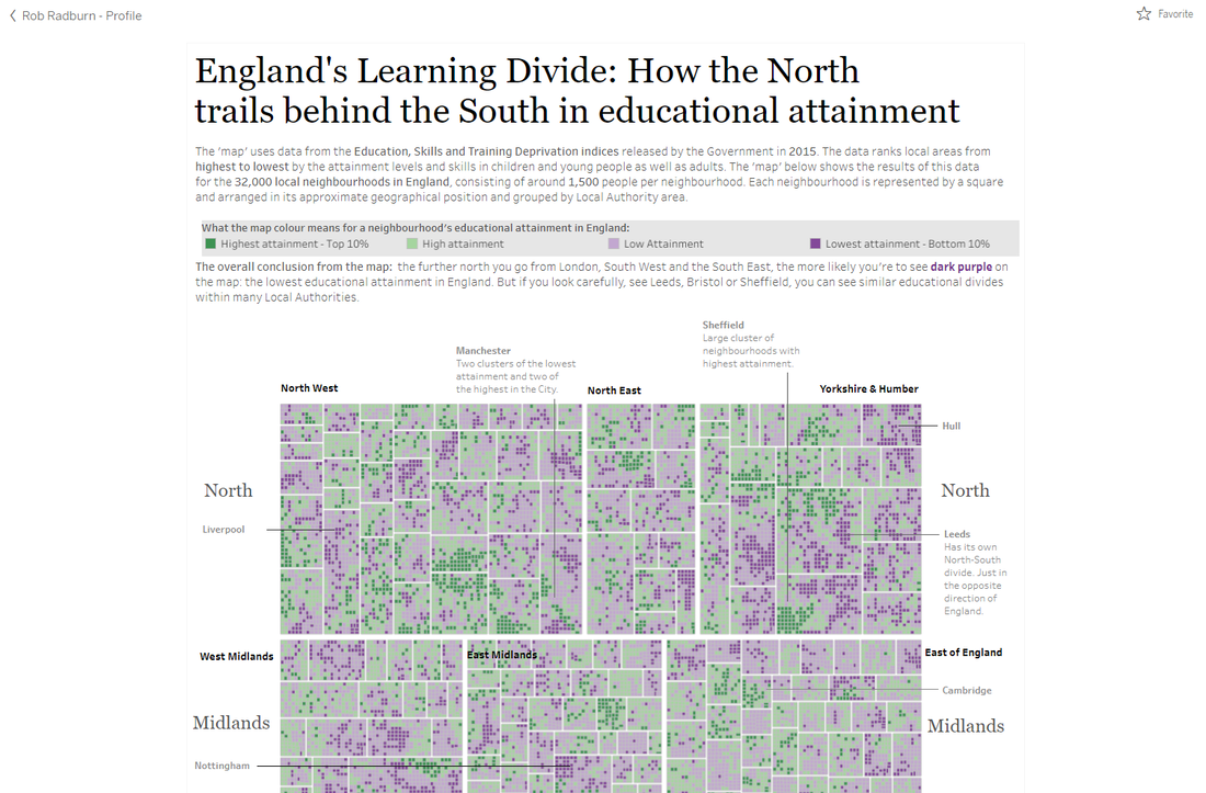
0 Comments
Leave a Reply. |
AuthorWrite something about yourself. No need to be fancy, just an overview. ArchivesCategories |
 RSS Feed
